SpaceOn
Storing belongings in a convenient and affordable way


Role
UX Designer, UX Researcher
Tools
Figma, Midjourney
Timelines
1st Iteration 01.2023-02.2023
2nd Iteration 03.2023-04.2023
3rd Iteration 03.2024-04.2024
Goals
Help people find convenient and affordable storage spaces, and assist those with extra home space in making productive use of it.
Background & Initial Problems
There are many co-op students and frequent travellers who need to settle in another place frequently. However, moving with a lot of belongings is challenging, especially without a car or for long distances. Additionally, some households have unused spaces but don't know how to utilize them.
The Solution
To address these issues, I designed SpaceOn, an app to help people find convenient and affordable storage spaces for their belongings, for a temporary time period based on their needs.
Meanwhile, it assists those with extra home space in making productive use of it.
Problem Statement
Coop students and frequent travellers face challenges carrying belongings without cars or for long distances. SpaceOn connects people needing storage with those having unused home spaces.
Empathise
To understand users better, I arranged user interviews to gather their feedback and opinions on current issues and alternative solutions. I used open-ended questions throughout the interview, because I believe by asking open-ended questions, the answer will get closer and closer to the real problems.
User Interview - Questions
1. What is your occupation? (This is used to ask correct questions to correct customer segment)
For potential renters:
2. Have you ever found yourself in a situation where you wished you had an option for temporarily storing your belongings?
3. What services or ways did you use to address your problems?
4. What difficulties did you find when using those services?
For potential hosts:
2. How would you make use of your free spaces in your home if you have any?
3. What platforms or ways did you use to advertise your free spaces?
4. What difficulties did you find when using those platforms?
User Interview - Answers (Potential Renters)
Situation (10 interviewees)
7/10 said:
They "need storage spaces between leases (mostly happened every four months)".
2/10 said:
They "don't have too much things, so they don't worry about the case".
1/10 said:
They "don't need storage spaces because their home is nearby".
Services or ways (among 7 interviewees who night need storage spaces)
4/7 said:
"Asked their friends to offer a space."
2/7 said:
"Used AccessStorage/StorLoft/Airbnb."
1/7 said:
He would "carry all the things with him to another rental place".
Difficulties
-
Those companies are far away from where they are living
-
Waste of money to use those services
-
Don't want to bother their friends
User Interview - Answers (Potential Hosts)
How (5 interviewees)
3/5 said:
"Rent out it as a bedroom."
1/5 said:
"Rent out it as a storage space."
1/5 said:
"Won't rent out it."
Platforms or ways (among 4 interviewees who would rent out the free spaces)
3/5 said:
"Use Airbnb for renting out rooms."
4/5 said:
"Use social media groups to post advertisements."
Difficulties
-
Talking with customers on social media is time-consuming
-
If no enough spaces, cannot use Airbnb to rent out spaces
After the interviews, I found that:
-
Potential renters need storage spaces between leases/moves.
-
It is expensive and inconvenient to use current storage services.
-
There is no existing application for local hosts to rent out storage spaces conveniently.
It is worth it to design an application to solve those issues.
Hi-Fidelity
Below are my Hi-Fidelity designs, with usability testing conducted during the design process.
Interested in how I got here? Click "Ideation" on the side menu to learn more!
Sign In Page


(2)
Sign up screen

(3)
Sign in screen

(4)
Hom page
(1)
Launch screen with "Sign in as Guest" option
Offering a 'Sign in as Guest' option lets new users check out the product without making an account. This helps keep them interested and exploring the product.
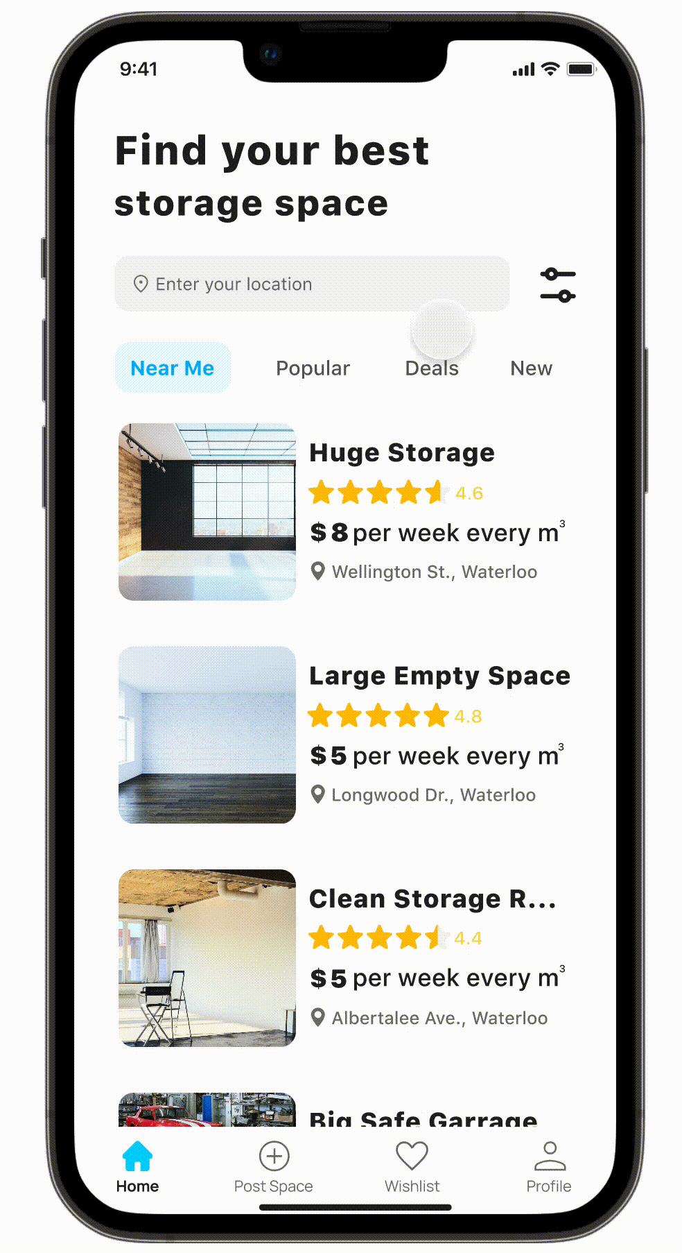
Home Page
(1)
Home page with card view listing
(2)
Home page with location set
(3)
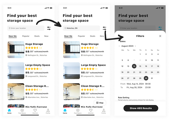
Filter panel
I arranged space listings with card view, using white space instead of dividers between each post. Inspired by Airbnb, white space enhances clarity and helps users focus on information.

(4)
Full filter page
Previous designs of the filter page are shown below...I see my improvements!


.png)
1st Iteration
The black outline gives a dark and unpleasant feel, making the interface look outdated.
2nd Iteration
Although the black strock was removed and the page looks cleaner, the input area was too small.
3rd Iteration
Yes! An additional-long filter panal was designed to facilitate user experience.
Detail Page

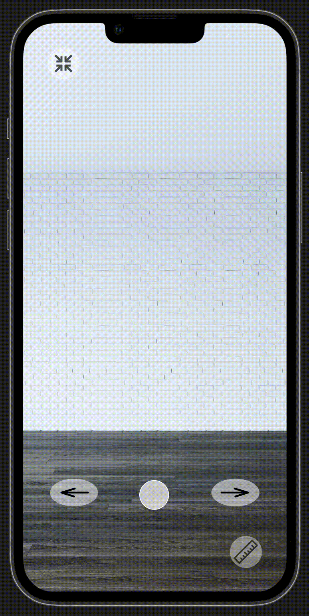
The 3D virtual tour:
Lets renters see the real look of the storage spaces.

The 3D scanning & AI view:
An easier way for resource calculation and allocation.
As you may notice, there are different cases...
What about too many belongings? What about the space is too large for the storage needs?

Case 1 - Too many belongings
AR Viewing
Message: "The space seems smaller than you need..."

Case 2 - The spcae is too big
AR Viewing

Case 3 - The space suits the need
AR Viewing
Message: "This space seems much bigger than you need..."
Message: "This space seems fits your needs!"
And, this is the full view of the detail page!

Click on the "Heart" on the top right corner will save the posting
Click on the "share" icon can share this detail page to other people
Click on "84 Review" will bring users to the review page
Click on "Change Units" to customize unit settings
Click on the photo icon to start 3D scanning
The "Description" section is optional for hosts who post the space
Click on "View All" will bring users to the review page
The "Booking Now" button will stay on the screen as the screen is scrolling down
Tap the map will open up the map app
Available dates in a calendar form
Booking Page
Similar to the cases mentioned in Detail Page, there are different cases for Capacity...
Too many belongings? The space is too large for the storage needs?

Case 1 - Too many belongings
AR Viewing

Case 2 - The spcae is too big
AR Viewing

Case 3 - The space suits the need
AR Viewing
Message: "We are sorry that we cannot book this space for you."
Message: "By confirming this booking, you agree to share this storage space with others."
No warning message
Continue with the booking process...

(1)
Photos added
(2)
Dates added
(3)
Booking review
(4)
View all photos
(5)
Single photo
Three Iterations & Design Choices... Learn more about usability testing process


2nd Iteration
The simplified method made the task simpler, but was not accurate for estimating space needed.
1st Iteration
Too many details needed to be manually inputted, which caused a lot of complain from users during usability testing.
3rd Iteration
Yes! The 3D scanning and AI help the process to be easier and more accurate.
Lastly, congratulations to you for successfully booking the space!
.png)
Usability Testing...and Three Iterations
As a crucial feature, I tested SpaceOn's booking process to ensure users can easily reserve a space. Volunteers followed a realistic scenario to mimic actual usage.
First and Second Iteration
Scenario
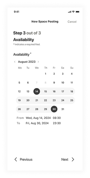
"You are at the end of the semester and you are going to move to another condo for the next semester. However, you had to move out of your current room on August 14th, but your new landlord told you you cannot move in until August 30th.
You haven't found a place to stay during that week, therefore, you decided to travel for one week, but you cannot carry all your belongings with you.
Therefore, you opened SpaceOn, and are trying to find a storage place and book that space."


Third Iteration
Scenario
Using the same scenario, in-test questions, and post-test questions, but with different interviewees, the new round of usability testing begins.
.png)

Welcome, Hosts!
Posting a Space!
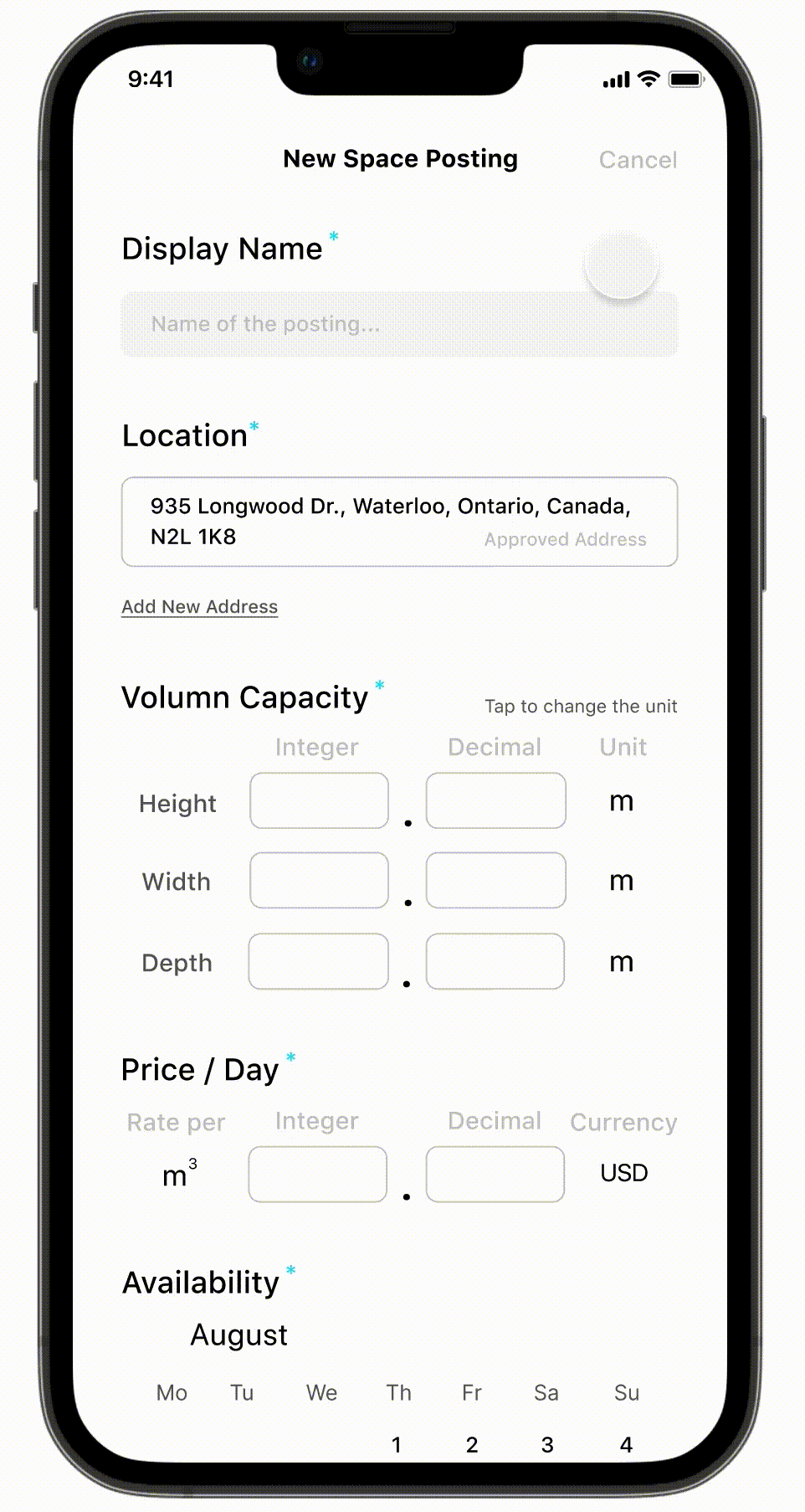
Posting Page
The posting process has been broken down into three smaller sub-tasks.


(Task 1 - Default)
Fill in the volume capacity and rate.
Fill in the basic information.
(Task 2 - Default)
(Task 1 - Error)
Error message shows if mandatory fields are not filled.
(Task 2 - Space Added)
Space added using 3D scanning.


(Task 2 - View Single Space)
Users can change units for their rate setting.
Single space made by 3D scanning is shown.
(Task 2 - Change units)
(Task 2 - Error)
(Task 3 - Availability)
Error message shows if mandatory fields are not filled.
Fill out the dates for availability.


(Review Page)
(All Set)
(View All Photos)
Users can view all photos that they added.
(All Postings)
Hosts can view all postings they made in Profile > My Postings.
More details about the 3D scanning!
3D scanning service offered by company like Polycam was considered to be integrated into SpaceOn, for both the rental process and the posting process.
(Disclaimer: Not sponsored. Images below are real screenshots when using Polycam.)


Three Iterations & Usability Testing
In the initial design, all posting tasks were on one page for simplicity. I believed scrolling was easier than switching pages and could avoid potential technical issues.


Again, as it is another main feature, I conducted a usability testing session with my Hi-Fi prototyping with interviewees:

However, besides from the positive feedback, after observing the actions and emotional changes of my three interviewees:
-
2/3 asked "more tasks?"
-
1/3 said "are all of these mandatory?"
-
2/3 put down their phones on the desk when filling the last tasks


Therefore, I created my second iteration of the design, which are the three pages with sub-tasks on each of them.


Responsive Design
Responsive design is vital in today's software development. Even though many people prefer phones, there's a significant number of web users who benefit from web applications.
I create the most important pages using responsive design:
1. Home Page, 2. Search Result Page, and 3. Detail Page


Design Process
In order to design a good user-centric application, I followed the five steps for my entire design process.

Image from https://thomas-sokolowski.com/
Define
To gain deeper insight into user challenges, I researched the alternative solutions they utilized, including AccessStorage, StorLost, and Airbnb mentioned in interviews. Conducting competitor research allows me to understand their strengths, thus improving my product's capabilities.
Competitor Research

Business Goal
1. Connect local hosts and renters together
2. Provide renters nearby and affordable storage
Product Goal
1. Use AI to help visualize the space
2. Provide a straightforward way for renters to book a space
3. Provide a straightforward way for hosts to post a space
Use Case
I created some use cases to help me keep track of mandatory features.
Book a storage space
-
As a renter, I want to be able to provide payment information so that I can book a storage space.
-
As a renter, I want to be able to search for storage spaces on map so that I can find one near me.
-
As a renter, I want to be able to search through available storage spaces by price so I can review the ones that fit my budget.
-
As a renter, I want to be able to search through available storage spaces by volume so I can review the ones that meet my needs.
Post available storage spaces
-
As a host, I want to be able to share photos of my spare spaces at home on the platform so I can advertise how much space I have.
-
As a host, I want to be able to provide my storage information including my contact information and location information of my house onto the platform so that renters can contact me.
-
As a host, I want to be able to have a safe method to receive my rental payment so that I can generate extra income.
-
As a host, I want track which dates are been booked and basic renter information including the name and contact information so that I don't have a double-booked space.
Read / write reviews about storage spaces / users
-
As a renter, I want to be able to review a host so that other renters know what to expect with the host’s storage space.
-
As a renter, I want to read about experiences others have had to leave items with a particular host.
-
As a renter, I want to search prospective hosts by how past renters have felt so I can quickly find one I can expect to have a positive experience with.


Ideate
User Flow
User flows can help me visualize the interactions between pages.
I divided the app into two main sections based on the MVP.
1. Booking a space: this is where Renters try to book a storage space after navigating through the detail page.
2. Posting a space: this is where Hosts can post a storage space.
Booking a space

Yes
Yes
No
No
Posting a space

Yes
Yes
No
No
Prototype
Low-Fidelity
After finishing the user flows, I started to draw a low-fidelity prototype. These prototypes can help me double-check the interaction between pages and help to find any steps missing or any steps that should be removed.
Sign In, Sign Up
.png)


.png)
Listing Page, Detail Page, Booking Page


.png)
Verification Pages


Posting Pages

The long one is the first draft of the posting page design, which contains all fields in one long page. In Hi-Fi section there is a detailed usability testing process record.
This design is denied because the design will let users feel stressed when they are trying to fill all fields but find the page is too long.
The ones below are the second design for the posting pages, and they are chosen for Hi-Fidelity design.
This design breaks the one big task into several smaller tasks which seem to be very easy to solve, which helps to comfort users and encourage them to finish all tasks.


The "*" design is used for giving users a sense of a light-weighted workload. With "*" beside of some fields, users will feel they only have to do "these work", rather than have to do "all the work".


Palette
Blue can give people a feeling of peace and space, therefore, I chose blue as the primary color of this app.
.png)