Foodest
Learning cooking in a more intuitive and organized way
Cooking on ones own has become popular through the years, either because society is more engaged in DIY making - Do It by Myself - or because it would be cheaper to cook at home than eat outside.
However, there are always voices saying that
-
"What shall I cook today?"
-
"Why it looks different from what the recipes made?"
-
"How do they proceed to the next step?"
It turns out that there are some designs in existing products that make it difficult for users to choose recipes or learn how to cook.
Therefore, I decided to design an app which can help users learn cooking in a more intuitive way.
Empathise
To understand users better, I arranged user interviews to gather their feedback and opinions on current issues and alternative solutions. I used the "5 whys" analysis method for my user interviews. I believe by continually asking "why", the answer will get closer and closer to the real problems.
User Interview
Part 1: Interview Questions
-
Why would you use cooking apps/platforms?
-
What apps/platforms do you use the most?
-
Why would you choose those apps/platforms?
-
Did you try any other apps but stop using them?
-
Why did you stop using those apps?
Some questions were made during the interview depended on what the intervewee answered: -
Why would you use two apps together?
-
Why don't you use cooking apps?
Part 2: Interview Summary
I broke the answers into three categories, Situations, Solutions, and Sufferings.
Situations:
-
Most interviewees use cooking apps/platforms to cook their meals.
-
Some of them use cooking apps/platforms to create creative meal projects.
Solutions:
-
Almost every interviewee uses different cooking apps/platforms to learn to cook.
-
Tasty, SideChef, and SoYummy are the most commonly-mentioned apps.
-
All of them use more than one app/platform together.
Sufferings:
-
Some apps only have scripts, but sometimes hard to understand what should be done. That is why YouTube is used.
-
Some apps only have video but no scripts, and not everyone prefers watching videos. That is why some users use YouTube as one of their tools but not only depend on it.
-
Some apps don't have clear categories and it is hard to find what the user what to cook.
-
Most apps don't have various types of cuisines.
Part 3: Conclusion from Interview
-
Many users use more than one apps/platforms to learn cook because different apps/platforms have their own strength which are not in other apps, such scripts and videos.
-
Most apps/platforms are lack of clear categories, which makes it hard for users to find contents.
These problems are going to be solved in Foodest.
High-Fidelity
Finally, the high-fidelity prototyping came to place. Because of the time limit, I had some testings made during the prototyping stage instead of testing the completed product at the end of the prototyping stage.
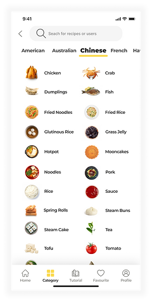
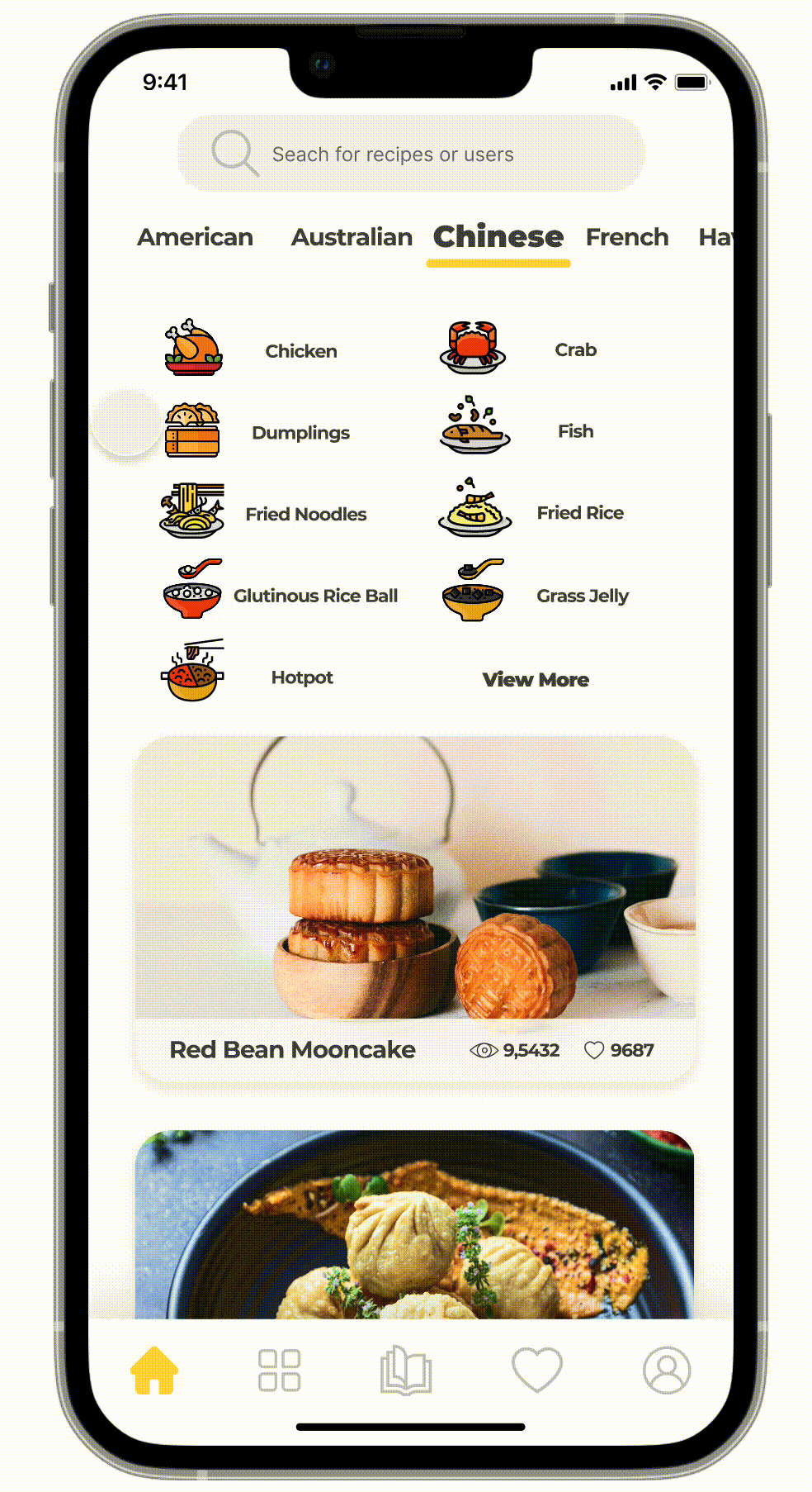
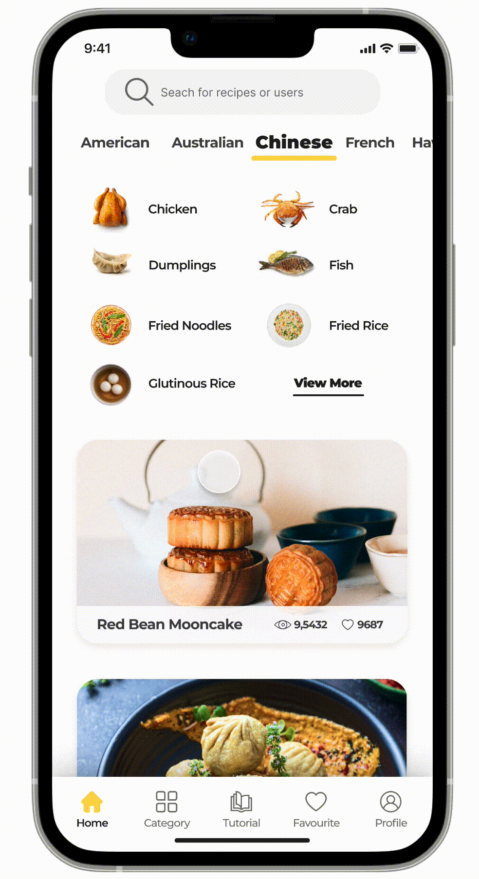
#1. Home Page & Category Page

Category
There were several design iterations for the categories layout.


The third design was chosen to be the current version of the layout because:
-
Label texts are added to the navigation bar icons to avoid confusion.
-
Real food images would be more attractive to users because it feels more real.
-
Separating contents using white spaces feels more comfortable and cleaner than using strokes to separate contents.
-
The lighter primary color - yellow - looks more attractive than the orange color.
Listing
There were several designs for the listing page.

The right design was chosen because
-
The VIP icon does not cover the image.
-
The design does not break the reading flow of the list of contents.
Search & Filter
Lastly, the search field and the filter are designed to help users search for more accurate results.


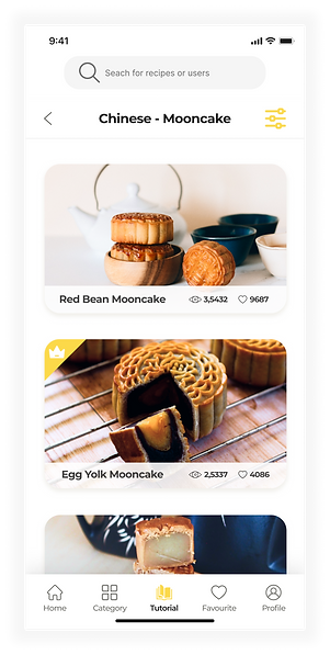
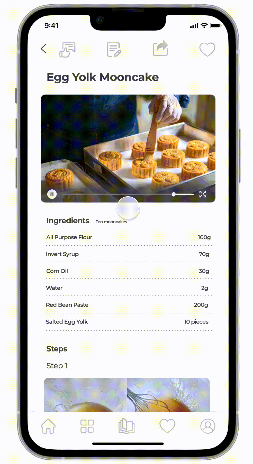
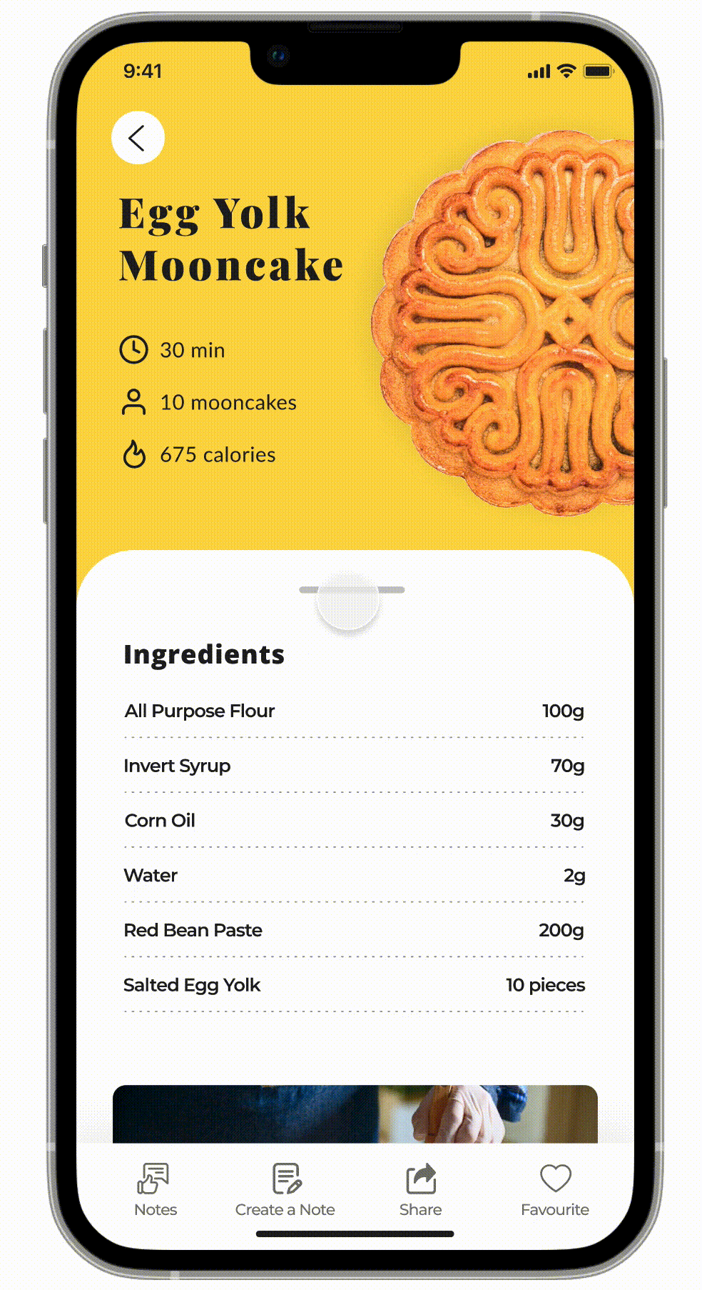
#2. Detail Page


.png)
-
On the detail page, users can share their creations by posting discussions under the tutorial by creating a note.
-
They can also review other users' notes, creations, and comments.
.png)
Design Iterations
On the left was the first design for the detail page.
.png)
Difference 1: Navigation bar
There are two navigation bars in the first design. The top bar was for actions for the detail page, Notes, Create a Note, Share, and Favourite. The bottom bar was the main navigation bar.
This design was intended to give users quicker access to the main pages from the detail page by using the bottom navigation bar while being able to do the actions using the top bar.
Difference 2: Label texts
There were no label texts on the first design, but label texts are added on the second iteration because missing label texts caused some confusion when users were trying to guess which icon should they click.

Usability Testing in Design Iterations
First Iteration Usability Testing
Because this is one of the main pages all users using this app will open, therefore, I conducted usability testing to check if this (first) design was easy to use as soon as I finished the first design.
I made two scenarios for my volunteers to do the two tasks:
Task 1.
It is Mid-Autumn Festival, and you want to make some egg yolk mooncakes. Now, you opened Foodest, and are trying to find the Egg Yolk Mooncake tutorial without using the search icon on the top, and start reading the tutorial.
(This requires them to first navigate to the category page, find the Mooncake category, and click on the Egg Yolk Mooncake tutorial.)
Task 2.
You want to see what other learners say about this tutorial and if they have successfully made mooncakes. Now you are trying to find Notes posted by other users.
Task 3.
You made some great mooncakes, and want to share the photos under this tutorial.

(One of my Usability Testing volunteers)
Photo credit by Yibo
Task 1 went smoothly as hoped, starting from opening the app, go to Category Page from Home Page, go to Listing Page from Category Page, and to Detail Page.
However, issues came when Task 2 started, which was when users were trying to go back to the previous page from the Detail Page.
"I thought this book button (at the bottom) is the Notes button, but it took me back?"
"The back button at the top will take me where?"
"Should I use the icons below or the top?"
"What does this icon mean?"
There were too many icons on the page, which took time for users to think which one should they use.
Second Iteration Usability Testing
Therefore, in the second design:
1. There is only one navigation bar on the page, which is for only the actions on the detail page. The navigation bar of the main pages is deleted because those actions can be accessed on previous pages, and are not essentially related to the Detail Page.
2. Label texts for icons are added to avoid confusion.
Usability tests were made again after the second design was finished to make sure the later design solves those issues.


(Two of my Usability Testing volunteers)
Photo credit by Yibo
This time, Task 2 and Task 3 all went well because the new design solved the issues of:
-
Choosing from a massive number of icons.
-
Confusion about the meaning of different but similar icons.
That being said, all my volunteers now can easily:
1. Find a tutorial
2. Navigate to Notes to see what other users say
3. Use Create A Note to post and share their own creations
without any confusion.
I also used the opportunities to test if the visual design changes were worth making.
Therefore, I asked some in-test questions:
-
How do you like the interface?
-
How do you think about the order of the information?
The answers I got are:
-
"The images are attracting."
-
"The real food images are way better than the carton ones."
-
"I prefer video first."
-
"I think put ingredients at the top is better."
The answer of "real images" confirmed my intuition that using real food images would give a better user experience.
#3. Detail Page - Review Posts & Follow Users


-
By clicking the Notes icon on the bottom navigation bar under the page, users will be directed to the Notes - also known as the Comments page.
-
This is the page where users share their creations, ideas, and comments for that tutorial.
-
On this Notes page, users can give a thumb to posts they like, leave comments, or follow other users.
-
If the Comment or the Like icon is highlighted, meaning that you left a comment for this post or you gave a thumb to the post.
Ways to Give A Thumb or Follow A User
Users can give a thumb to a post / follow another user:
Method #1: on the Notes page by clicking on the Like icon at the bottom of the post / Follow icon at the top.
Method #2: in the post detail page after clicking on the post and opening the detail of the post.


-
When successfully following a user, a toast will show on the top to give the user instant feedback and tell her that she has successfully followed the user, and she can find the user in her profile.
-
The Follow icon will be highlighted after the user is followed.
After 5 seconds, the toast will fade out and disappear, or users can close the toast using the close icon button at the top right corner.

-
The toast will show up when followed a user.
-
Only the comments made by yourself can be edited later, and users cannot edit other users' comments.
-
The post supports multiple images added.
-
Posts are also able to be shared outside of the application.
#4. Detail Page - Create A Post

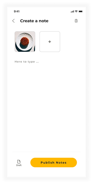
-
By clicking the Create A Note icon on the bottom navigation bar under the page, users will be directed to the Create A Note page - also known as the Post page.
-
This is the page where users create a new note to share their creations, ideas, and comments for that tutorial.
-
Users can save the draft of the note they are going to edit later.

If the Delete button is clicked, or the Back button is clicked, a notification will show to the user.

After the Publish Notes is clicked, the note will be published.

-
Only the author themselves can edit the note they created.
-
The comment can only be edited by the users who created that comment.
#5. Profile Page

-
Users who are not currently in VIP status will see a grey icon.
-
Their level tag will also be in grey.
-
There are four ways to direct users to the VIP Plan page:
1. Clicking on this button.
2. Clicking on the two grey tags above.
3. Clicking on any level status tag of any user or VIP tag under
any VIP user's name.
4. Clicking on any VIP tutorial.
-
They can access their comments history, notes they created, who are their followers, and whom they are following here.
VIP Plan Page


There was a first design version for the VIP Plan options.

However, the icon seems to be too distractive to encourage users to purchase the VIP plan as quickly as possible, therefore, the cleaner design was chosen.

Design Process
In order to design a good user-centric application, I followed the five steps for my entire design process.

Image from https://thomas-sokolowski.com/
Step 2: Define
To understand users' pain points better, I started to do some research on those alternative solutions users used for solving their issues. Those competitors are mentioned in the interviews, which are Tasty, SideChef, and SoYummy. Doing competitor research can help me get to know more about the advantages of competitors, and therefore to better enhance the strengths of my product.
Competitor Research
.png)
Persona
I created two personas using the information I collected from the user interview. Keeping personas beside me when designing the product can help remind me to always keep empathy in mind.
.png)
Conclusion from Persona and Competitor Research
After creating the two personas and comparing some of the competitors in the market, I drew a conclusion from three perspectives:
1. Main needs from users
-
various range of cuisine types
-
some requirements for recipes including gluten-free
-
videos and scripts all in one place
2. Considerations for user flow for users
-
they should be able to choose different types of recipes based on regions or ingredients
-
they should be able to filter out recipes based on diet requirements
-
they should be able to watch videos for tutorials
-
they should be able to share creations in the app
3. Considerations for UX design:
-
There should be a category section for different regions - American, Asian, etc.
-
There should be another category section for different types of food - chicken, fish, etc.
-
There should be a filter for level of difficulties or diet to filter out the best results for users.
-
The video and scripts should be on the same page.
-
There should be some networking features for users to share creations.
Business Goal
1. Provide an easy-to-follow cooking tutorial app with both videos and scripts.
2. Encourage as many users to join VIPs as possible.
Product Goal
1. Provide a wide range of cooking options in terms of food cultures and locations.
2. Provide a clean and clear category layout for users to find the recipes they want.
2. Provide a straightforward way for learners to follow and learn.
3. Provide multiple entrances for users to access the VIP Plan page.
Step 3: Ideate
User Flow
With business goals and use cases in hand, I started creating user flows for different users, who are devided into two main categories, VIP users and Non-VIP users.
Overall User Flow for All Users
All VIP Users
.png)


All Non-VIP Users
Non-VIP Users: who don't pay for any contents
Non-VIP Users: who pay for one-time purchase for one VIP content
Non-VIP Users: who become a VIP
Step 4: Prototype
Low-Fidelity
Home Page & Listing Page

Detail Page & Comment Page

Profile Page & VIP Plan Page

Palette
Yellow and orange can give people a feeling of hunger and tasty food, therefore, I chose orange and yellow as the primary colors of this app. Orange would be used for CTA, and yellow is used for other icons which are not as important as the CTA buttons.

WCAG
During my design process, I made sure all necessary text fields - including titles, ingredients, steps, notes, and comments - passed WCAG (all of them passed at least AA standard). This helps me ensure all information that is designed to be read by users is always readable.
For example, in the first iteration of CTA / filter designs, the orange color of the button and the white color of the text were used. However, this combanition failed the WCAG AA test. Therefore, the texts are changed into the black color (#222222), which let the combanition passed AAA standard.
First design - denined because the texts were not passing AA standard.


.png)
Second design - ensured all texts in mandatory fileds passed at least AA standard.


